App Styling
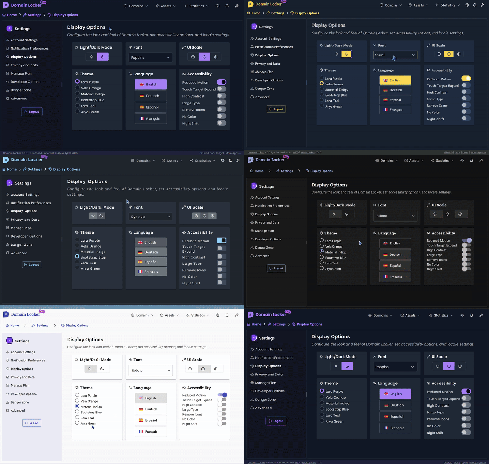
We try and keep styling to a minimum. We use components from PrimeNG, which are pre-styled and themable. Then Tailwind wherever a specific style is needed. Very occasionally, we use custom CSS.
This still gives the user plenty of choice as to how they'd like the app to look and feel.

Tailwind
What is Tailwind?
If you're not already familiar with it, Tailwind CSS is a utility-first CSS framework that provides low-level utility classes to build designs quickly without writing actual CSS.
So instead of defining separate CSS styles, you apply classes directly to HTML elements.
How Tailwind Works
Tailwind:
- Uses utility classes instead of traditional CSS rules.
- Removes unused styles at build time to keep the CSS bundle small.
- Allows responsive, hover, focus, and dark mode variants by prefixing classes.
Example:
<button class="bg-blue-500 hover:bg-blue-700 text-white font-bold py-2 px-4 rounded">
  Click me
</button>
This creates a button with a blue background that darkens on hover, white text, bold font, padding, and rounded corners—all with no custom CSS.
How to Use Tailwind in Domain Locker
Adding styles is as simple as applying classes to elements in templates:
<div class="p-4 bg-gray-100 rounded shadow-lg">
  <h2 class="text-xl font-semibold">Styled Card</h2>
  <p class="text-gray-600">This is a simple example.</p>
</div>
For responsiveness:
<div class="p-4 md:p-8 lg:p-12">
  Responsive padding
</div>p-4applies padding on all screen sizes.md:p-8increases padding on medium screens (min-width: 768px).lg:p-12increases padding on large screens (min-width: 1024px).
For interactive states:
<button class="bg-green-500 hover:bg-green-700 focus:ring focus:ring-green-300">
  Hover & Focus
</button>
Tailwind Configuration
Tailwind is configured in tailwind.config.js.
We use the default Tailwind setup with a few tweaks:
- Custom colours based on the PrimeNG theme.
- Content paths defined to remove unused styles.
- Extended spacing and typography for better flexibility.
If needed, you can modify tailwind.config.js to extend the default styles.
Using PrimeNG Styles
PrimeNG comes with its own styles and theming system. Some components (like buttons, dialogs, and tables) already have default styles.
To apply a PrimeNG theme, set it in theme.css:
@import 'primeng/resources/themes/lara-light-blue/theme.css';PrimeNG components can be styled with both:
- Built-in themes (via PrimeNG classes)
- Tailwind utility classes (to override or enhance styles)
Example:
<p-button label="Save" class="bg-primary text-white p-3 rounded-lg shadow-md"></p-button>When to Use Custom CSS?
Most of the time, Tailwind is enough. But for very specific styling, you may need custom CSS.
Best Practices for Custom CSS
- Avoid unnecessary overrides – Tailwind + PrimeNG should cover 99% of cases.
- Use inline styles or
:hostin components rather than global styles. - Keep styles scoped within Angular components.
Example of scoped CSS in an Angular component:
@Component({
  selector: 'app-custom-box',
  template: '<div class="custom-box">Content</div>',
  styles: [\`
    .custom-box {
      background-color: #f9fafb;
      border-radius: 8px;
      padding: 16px;
      box-shadow: 0 4px 6px rgba(0, 0, 0, 0.1);
    }
  \`]
})
export class CustomBoxComponent {}
For more details, check out Tailwind Docs or PrimeNG Docs.